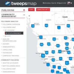
TweepsMap is a great Twitter tool to analyze and visualize your Twitter network.
As its name suggests, it does this by showing you how your followers are distributed on a map, in percentage terms.
Below you can see the distribution of my followers. Obviously most of my followers are in the US and Canada, however it is interesting to know where my followers are across the globe.

This follower data can also be viewed at the province/state level, as seen below, or even at the city level.

TweepsMap also offers other great analytics options, such as the ability to see inactive people you follow who haven’t tweeted in three or six months.
Here are some of the other powerful features of Tweepsmap.
online followers worldwide, interactively and at the city level. Discover followers and influencers by location so you can design campaigns accordingly.
Smart publishing. Live publishing based on followers’ interests at that moment, Best time to tweet (by region), tweet scheduler and more.
Analyze influencers and competitors. Comprehensive analysis of each account (including competitors).
Best time to tweet. This new Tweepsmap feature shows you the best time to tweet based on when your followers are online, and also based on the best amplification potential for your tweets (your followers’ followers).
Schedule tweets to be sent automatically at the best time. Schedule a daily number of tweets, every day in the future, set the repeat frequency (if any), edit when required – and Tweepsmap will automatically choose the time of day (based on the best times to tweet the profile).
Increase/decrease by region: absolute number, as well as delta in daily, weekly, monthly or custom dates by campaign dates.
Measure impact and reach so you can rate
UNIQUE. Deep analysis and engagement.
There are too many other great features of TweepsMap to describe at length here, but I will be doing a full review of this Twitter tool in the near future, so stay tuned for that, and check them out in the meantime!


